On black card, colored specialty papers, kraft, and other dark substrates, white ink is the go-to tool to create contrast and readability. It can act as an opaque underprint (white base) beneath CMYK/spot colors, or as standalone white text/graphics for a crisp, minimalist look.
When to Use White Ink
Dark substrates: black card, deep navy/green/burgundy, tinted kraft.
Color fidelity: brand colors, skin tones, or product photos that would otherwise look dull.
High-contrast elements: fine white type/lines, barcodes/QR codes on dark backgrounds.
Common Production Routes
Digital white (HP Indigo/UV digital): best for short runs, personalization, proofs; fast turnaround, smooth gradients.
Screen-printed white: very high opacity/thick film, great for solids and bold shapes; mind minimum line weights for detail.
Offset white (conventional/UV): good for mid–long runs on paper; often uses double-hit or high-coverage formulas.
Flexo white: efficient for cartons/labels/microflute; opacity driven by anilox and ink system.
Building a White Base (for Vivid Color)
Opacity target: on very dark stocks, aim for ≥85–90% opacity (often two hits or a high-coverage white).
Trapping & choke/spread: offset the color vs. white by 0.1–0.2 mm to prevent halos/white fringing.
Halftones & gradients: use slightly heavier white screens in fade zones to avoid breakup.
Selective underprint: only place white where color needs lift—keeps substrate feel and reduces risk/cost.
Overfinishing: test adhesion if adding matte/soft-touch film or varnish above white.
Design Tips (Legibility First)
Minimum strokes/type: keep ≥0.25–0.3 mm for fine white lines/reverse text.
Codes: black code on a solid white patch scans best; verify quiet zones after lamination/creasing.
Large white solids: screen-print or double-hit; consider a micro-texture pattern to hide minor mottle/scuffs.
Layering effects: white ink pairs beautifully with foil, spot UV, emboss/deboss for multi-level contrast.
Substrate Notes
Solid black (dyed-through) board: clean cut edges; strongest white contrast.
Textured/pearlescent/soft-touch papers: great tactility; proof for color cast on pearlescents.
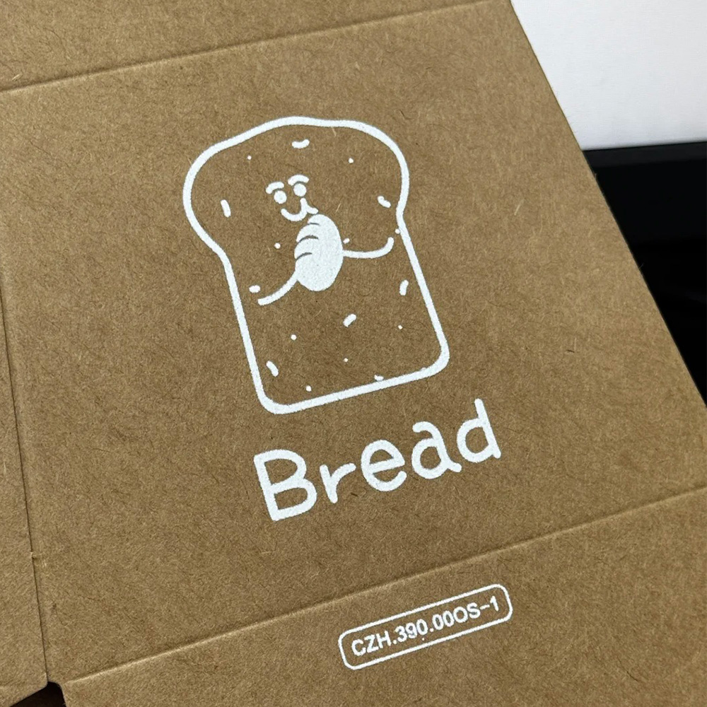
Kraft: white neutralizes the warm base; a warm-white tone can feel more natural.
Microflute (E/F) with litho-lam: print white + color on the label stock first, then laminate.
Quality & Consistency
Proofing: include a white-density ladder (single/double/spot boost) with color overprints.
Adhesion/rub tests: tape-pull and abrasion tests—dark mattes show scuffs fastest.
Process specs: lock ink series, screens/anilox, cylinder/plate curves; reuse for reorders.
Creasing/folding: white layers can be brittle—use deep scores and fold with the grain.
Typical Use Cases
Business cards & brand cards: white on black with spot UV or foil.
Rigid/gift boxes & sleeves: dark soft-touch wraps with white base + CMYK for rich visuals.
Labels & decals: white first on films/metallics, then colors for true tones.
Stationery & greeting: white ink illustrations on colored stocks + blind emboss.