What it is & how it works
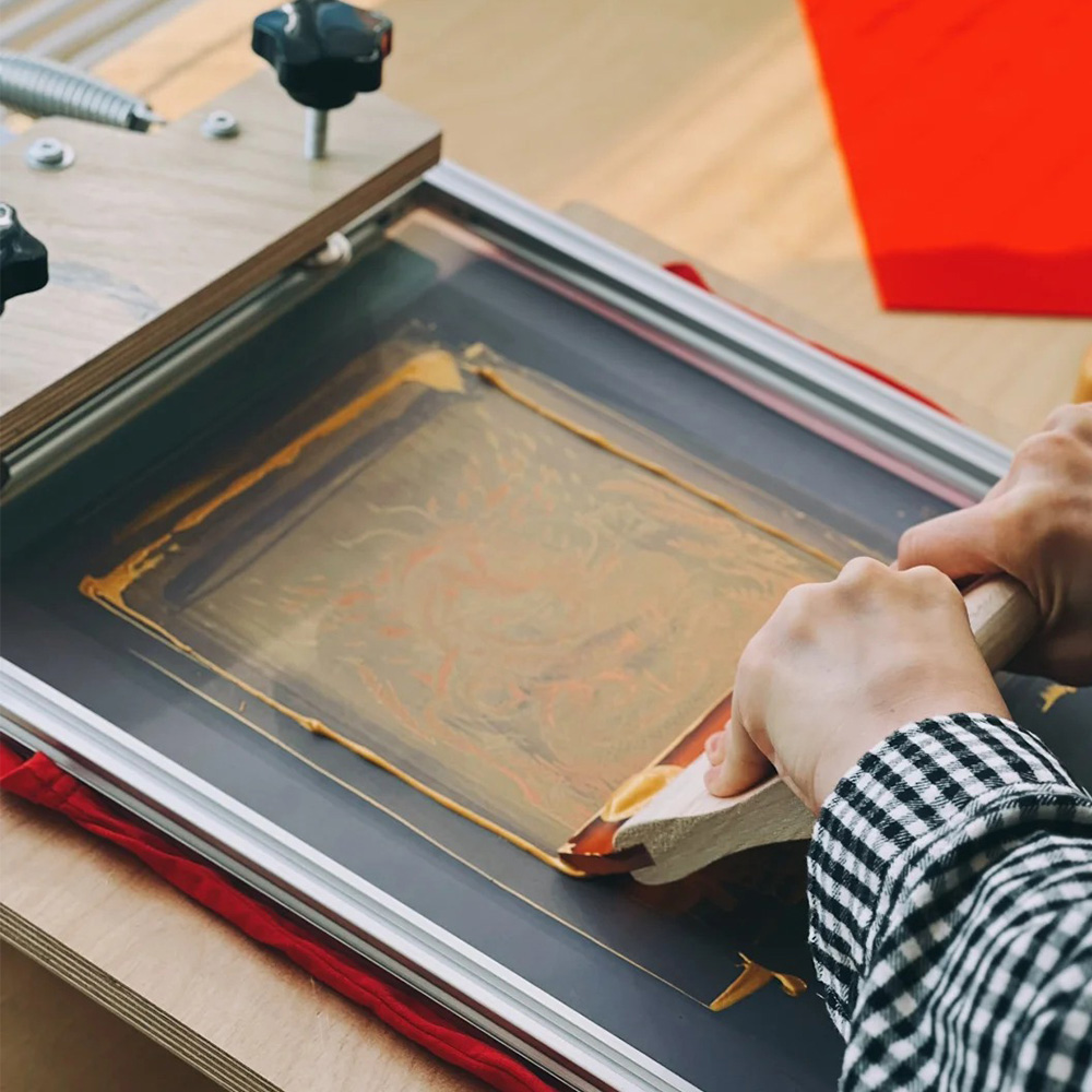
Silkscreen printing pushes ink through an image-opening in a mesh screen onto the substrate using a squeegee. Compared with offset or flexo, screen delivers a thicker ink film and stronger opacity, which is perfect for spot effects, tactile finishes, metallics, fluorescents, and high-cover white—even on slightly uneven or non-paper surfaces.
One line: when you want dimension, texture, and coverage, choose silkscreen.
What can it print on?
Paper & board: SBS/CCNB, coated art, black board, kraft (often with a screen white underprint).
Films & plastics: PP, PET, PVC (labels, windows, clear sleeves).
Metallic papers/laser films: for striking contrast and texture.
Slightly irregular surfaces: screen tolerates minor texture/relief better than most processes.
On kraft or dark stocks, screen opaque white first, then color for clean, bright results.
When is silkscreen the right choice?
Local enhancements: thick gloss UV, soft-touch/matte textures, metallic/pearlescent hits, micro-relief effects.
Logo emphasis: raised logos or slogans with high-build clear for premium first touch.
High opacity needs: bright colors or white on dark paper/board or metallized bases.
Short runs / multiple SKUs: limited gift sets, PR/KOL kits, seasonal sleeves.
Special inks: fluorescent, glow-in-the-dark, thermochromic, even conductive (for creative concepts).
How it pairs with CMYK & spot colors
With CMYK: print artwork (photos, gradients) by offset/digital, then screen the local effects (thick varnish, tactile, white, fluorescent).
With spot (Pantone): use spot via offset for brand accuracy; add screened whites, metallics, or high-build clears to amplify.
White underprint: for kraft, black board, or clear films, screen opaque white as a base, then print CMYK/spot on top.
Pros & cons
Pros
Thick, opaque ink film → strong coverage, visible relief/texture.
Substrate flexibility → handles less-than-perfectly smooth surfaces.
Outstanding local effects → boosts brand presence.
Agile for small batches → easy to set up for limited editions.
Cons
Slower throughput and more manual steps than offset/flexo.
Not for fine halftone images—screen is best for solids/lines, not photo realism.
Consistency depends on process control (mesh, ink viscosity, squeegee).
Dry/curing time must be managed (especially with high builds and multi-layer stacks).
Key process settings (the things that matter)
Mesh (threads per inch / per cm): higher mesh = finer detail, thinner ink; lower mesh = thicker deposit.
High-build gloss / tactile coats: 80–150 mesh
Fine lines / small type: 150–250 mesh
Emulsion & stencil thickness: thicker stencil = higher build; thinner = sharper edges.
Squeegee hardness: 70–80 Shore A is common (harder = thinner, sharper; softer = thicker, rounder).
Angle / pressure / speed: higher angle + more pressure → thinner, crisp; lower angle → thicker, risk of edge spread.
Off-contact: typically 1–3 mm; too low = sticking, too high = distortion.
Ink system: UV (fast cure, good rub), or water/solvent (match to substrate adhesion). Use low-migration sets for food/beauty.
Curing: UV one-shot; water/solvent needs tunnel drying + time to re-equilibrate before converting.
Best practice: do a material-true prototype to lock mesh, ink, deposit, and curing—especially for high-build layers.
Popular packaging effects & use cases
High-build spot gloss (thick UV): logo, product name, hero art—dramatic on matte-laminated backgrounds.
Tactile varnish / soft-touch / grit: “skin feel,” paper-fleece, micro-sand—great for gift sleeves and luxury sets.
Opaque white base: the go-to on kraft/black/clear.
Metallic/pearlescent accents: fine lines and motifs that pop over CMYK art.
Fluorescent/glow: limited runs and event kits—mind lightfastness and compliance.
Security/functional: micro-lines, selective conductive features (niche).
Aligning with finishing (avoid downstream issues)
Sequence: typically print → laminate/coat → screen local effects for maximum relief.
Foil & emboss: screen layers change surface energy and height—plan knockouts and sequence (e.g., foil first with knockouts, or foil after, then screen clear).
Die-cut/crease: avoid heavy builds over scores or knife lines to prevent cracking/edge burst; mark no-print zones on the dieline.
Stacking: don’t stack high until layers are fully cured—prevents setoff/blocking.
Cost & lead time (realistic expectations)
Cost drivers: screen making, ink mixing, operator time, waste; coverage area, number of colors/layers impact price.
Throughput: slower than offset/flexo—best for short to medium runs or high-value covers.
Sampling: request a real-stock screen sample (with the same lamination/coating) to verify build, feel, and adhesion.