1) What is a “spot color”?
A spot color is a pre-mixed ink printed as its own unit (e.g., Pantone 186 C red). Unlike CMYK—which builds color from tiny overlapping dots—spot ink prints one, solid hue, giving you higher purity, stability, and batch consistency. It’s ideal for brand primaries, big solid backgrounds, metallics, and fluorescents.
2) When to use spot vs CMYK?
Use spot (Pantone) when:
You need an exact brand color across runs and plants.
There’s a large solid area that must look smooth (CMYK can mottle).
You want metallic, fluorescent, pearlescent effects CMYK can’t mimic well.
You want tight consistency over long programs and reprints.
Use CMYK (or CMYK + spot) when:
You’re printing photos, gradients, complex imagery.
Budget or press units are limited—use CMYK for imagery and add 1–2 spots only where needed.
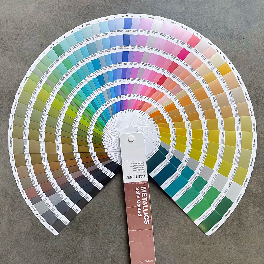
3) Pantone basics (C vs U vs specials)
Pantone C (Coated): for coated stocks (SBS, art board, film-laminated). Most folding cartons/gift boxes use C.
Pantone U (Uncoated): for uncoated stocks (natural kraft, writing papers). The same number looks lighter/greyer on U.
Metallic/Fluorescent/Pastel/Guides: use for special effects or tint references.
4) Getting the brand color right (end-to-end workflow)
Lock the master: Select the Pantone number(s) (C/U) and set a ΔE2000 target.
Choose the real stock: Color shifts with paper brightness/texture—confirm on the actual board/liner.
Ink formulation: Have the plant mix to Pantone or measure by spectro; keep same ink line/base system across sites.
Proofing: Digital proof for layout; for critical colors, do a press (wet) proof on real stock.
White underprint (if needed): On kraft or dark boards, lay opaque white first, then the spot color.
Match finishing: Lamination/coatings change appearance (matte mutes, gloss pops). Proof with the final finish.
5) Controlling variation (ΔE, density, process control)
Target ΔE2000: common targets ≤2.0–3.0; luxury logos ≤1.5–2.0.
Density/color strength: Measure each run with a densitometer/spectro to avoid drift.
Hold a master swatch: Archive a signed color strip (date, stock, press, ink batch) to match future runs.
Environment: Control plant temperature/humidity and pre-condition paper.
Change management: Any change of paper/film/ink batch/press → re-proof.
6) Working with CMYK (overprint, knockout, trapping)
Knockout vs overprint: Spots often knock out CMYK beneath to avoid mud; small black text can overprint.
Trapping: Add 0.05–0.10 mm trap to hide tiny register errors.
Spot gradients: A spot fading to 0% can band. Consider a spot+CMYK blend or convert the gradient to CMYK.
Print order: Metallics and coatings can swap sequence—confirm with the plant for best brilliance/adhesion.
7) Tricky cases & fixes
Bright brand color on kraft: Add opaque white underprint or a higher-opacity spot; relax ΔE slightly if needed.
Patchy large solids: Use a spot (not 4-color build), upgrade stock, optimize ink film/pressure; consider double-hit spot or a leveling coating.
Cross-plant shifts: Standardize ink line & formula, lock paper source, ship a master swatch + ΔE report with the PO.
Color after lamination: Matte darkens; gloss brightens. Always proof with the same film/coating.
Foil/spot UV overlap: Knock out under effects to keep edges clean and improve adhesion.
8) Metallics, fluorescents & other specials
Metallics (Pantone Metallics): Flake reflectivity loves smooth stock; matte film dulls the effect more than AQ/gloss.
Fluorescents: Ultra-bright but poor lightfastness—limit outdoor/high-UV exposure.
Pearlescent/iridescent/security: Check particle size, laydown, and downstream rub/migration; confirm compliance for food-contact work.