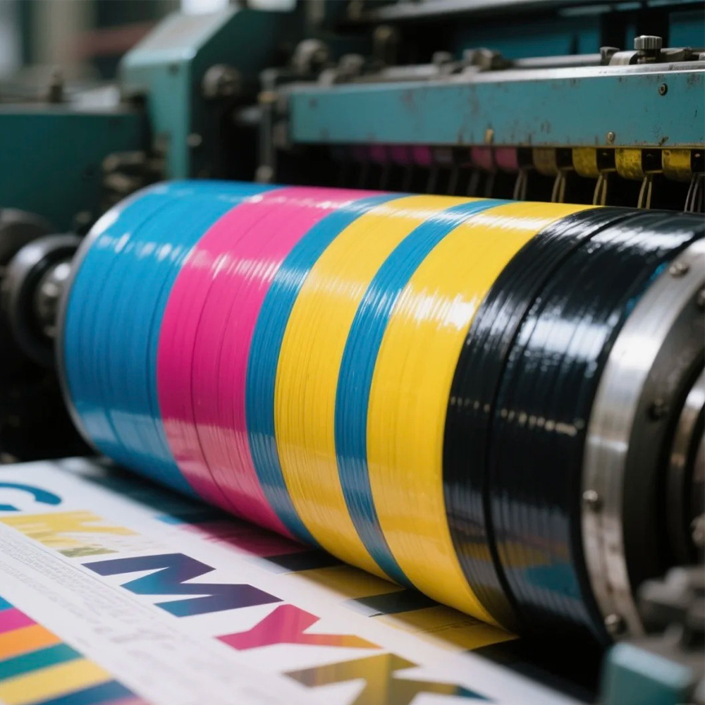
1) What is CMYK?
CMYK stands for Cyan, Magenta, Yellow, and Key (Black). By layering tiny halftone dots of these four inks, we can reproduce most colors used in packaging.
Screens use RGB (light). Printing uses CMYK (ink on paper) because it’s reflected light.
2) CMYK vs Spot Colors (Pantone)
CMYK (4-color): Best for photos, gradients, and most brand work. Cost-effective and flexible for short or mixed runs.
Spot color (Pantone): A premixed ink used when you need exact brand colors, very large solid areas, or special inks (metallic, fluorescent).
When to add a spot: CMYK can’t hit your brand color reliably, big solids look streaky, or you need metallic/fluorescent effects.
3) Prepress & Color Management (where accuracy is won)
ICC profiles: Use a shared standard (e.g., GRACoL/FOGRA) from design → proof → press to keep color consistent.
Proofing: Approve digital proofs for layout; use press (wet) proofs on the real stock for critical color.
Total Ink Limit (TAC): Keep combined C+M+Y+K within the agreed ceiling (often 300–320%). Too much ink = slow drying, setoff, curling.
UCR/GCR: Replace some CMY with K to stabilize grays and shadows and reduce ink load.
Black strategy:
Body text: K-only for crisp edges.
Rich black solids: e.g., C40 M30 Y30 K100 for a deep, even black (not for tiny text).
Trapping & overprint: Add slight overlaps to avoid white fringes from mis-register. Small black text typically overprints.
4) Halftones, Line Screen & Angles
Line screen (LPI): Higher LPI = finer detail but higher press/paper demands.
SBS/Coated board: 150–200 LPI (premium gift boxes can go higher).
Kraft/corrugated preprint: 100–133 LPI for stability.
Dot gain/TVI: Dots spread on paper and darken the image. Prepress curves compensate for this.
Screen angles (typical): C15°, M75°, Y0°, K45° (plants may vary) to reduce moiré.
5) Substrates, Inks & Coatings (why the same file looks different)
Board/Paper:
SBS/Coated: smooth, controlled absorption → vivid color and sharp detail.
Natural kraft: brown base warms/darkens CMYK; for bright colors, lay down an opaque white underprint first.
Corrugated preprint: consider later laminating/creasing; avoid pushing line screen/ink coverage too hard.
Ink systems: conventional/UV/water-based; choose low-migration sets for food contact. Each differs in gloss, rub resistance, and odor.
Finishing:
Film lamination: gloss = punchy color; matte = premium look. Film can affect recyclability and foil adhesion.
Aqueous/UV coatings: matte/gloss/soft-touch/rub-resist; AQ is recycling-friendly.
Specials: spot UV, foil, emboss/deboss—plan clear “no-print” areas beneath to keep edges clean.
6) Practical press targets for cartons/gift boxes
Line screen: retail cartons 150–175 LPI; luxury wraps 175–200 LPI (stock-dependent).
Minimum dots: avoid screened tints below 3–5%—they can drop out; protect highlights or use a light spot gray.
Type & reverse:
Small black text = K-only.
Reverse-out type from a color field should be ≥ 6 pt and slightly bolder.
Large solids: 4-color solids can mottle. Consider a spot color or use smoothing curves + quality coating/lamination.
White underprint: On kraft or dark stocks, add an opaque white base (flexo/screen/UV white) under CMYK for true color.
Grain/creasing: Align paper grain with fold direction; set crease rules/channels to curb cracking.
TAC: lock a plant-approved limit (e.g., 300%) to avoid setoff and drying issues.
7) Finishing & Converting (keep downstream happy)
Foil: leave a knockout under the foil; adhesion is often better on matte film or AQ than on high-slip gloss.
Emboss/deboss: agree emboss art first, then adjust CMYK art to enhance light/shadow.
Mounting & forming: coatings/films change stiffness—allow for dry time and humidity re-equilibration before lamination or box forming.
Scuff resistance: for long logistics chains, choose rub-resistant AQ or add spot protective varnish where it rubs.
8) Quick troubleshooting
Color shift: Check ICC/profile, paper batch, ink batch; compare to proof; verify water/ink balance, speed, and drying.
Setoff/dirtying: Lower TAC, adjust ink tack/viscosity, increase dry time; avoid stacking hot sheets.
Moiré/screening issues: Tweak angles or rescreen images; avoid overlapping repetitive textures.
Soft type/halos: Don’t build small text from 4 colors; review impression pressure and water/ink balance.
Uneven solids: Move to a spot color, even out anilox/rollers, or add a suitable coating/film.