At pandapackage.com, we specialize in creating custom packaging solutions that not only protect products but also enhance brand identity. In the cosmetic and skincare industry, packaging plays a crucial role in shaping consumer perception. By combining specialty paper with thoughtful color design, brands can communicate sophistication, natural values, and modern aesthetics. Below, we highlight a few examples of cosmetic and skincare boxes that showcase how color and material elevate the unboxing experience.
1. Soft Pastel Cube Boxes – Gentle and Vegan Appeal
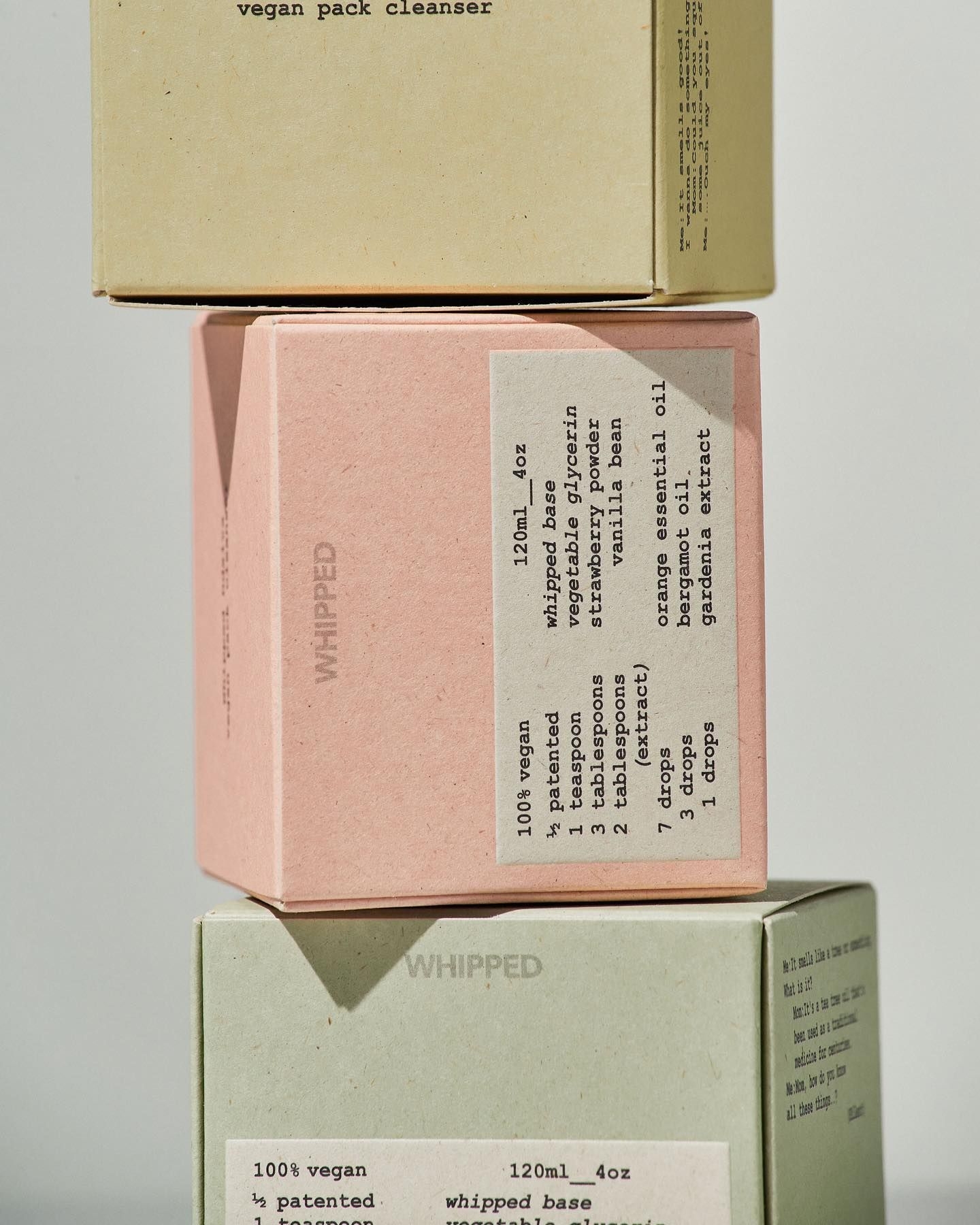
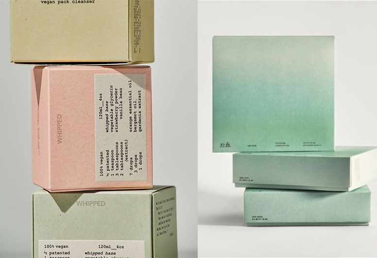
The first set of cube-shaped boxes demonstrates the charm of muted pastel colors like blush pink, sage green, and beige. Printed with minimal typography and recipe-style ingredient lists, these boxes feel approachable and authentic. The use of uncoated specialty paper gives a tactile, organic texture that aligns perfectly with the vegan and natural positioning of skincare products. Such packaging resonates with eco-conscious consumers who value transparency and clean aesthetics.
2. Gradient Green Flat Boxes – Minimalist Serenity
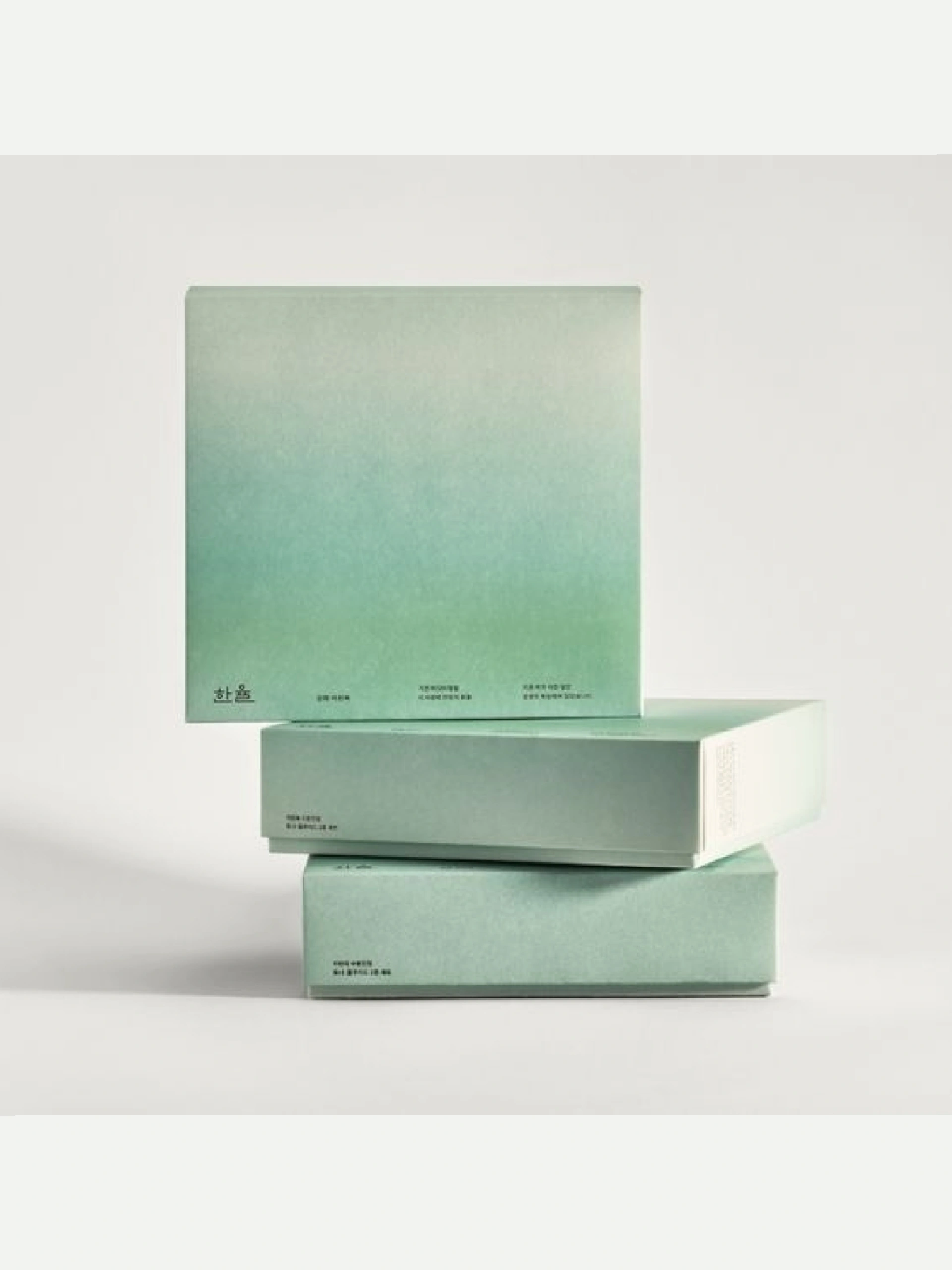
The second design features flat rectangular boxes in a subtle green gradient. This minimalist approach, with nearly bare surfaces and discreet typography, creates an aura of calm and refinement. Specialty paper enhances the smooth matte finish, avoiding gloss or shine, which would have disrupted the serene mood. For skincare brands, this style communicates purity and balance, appealing to customers seeking gentle, trustworthy products.
3. Bold Monotone Boxes – Modern and Direct
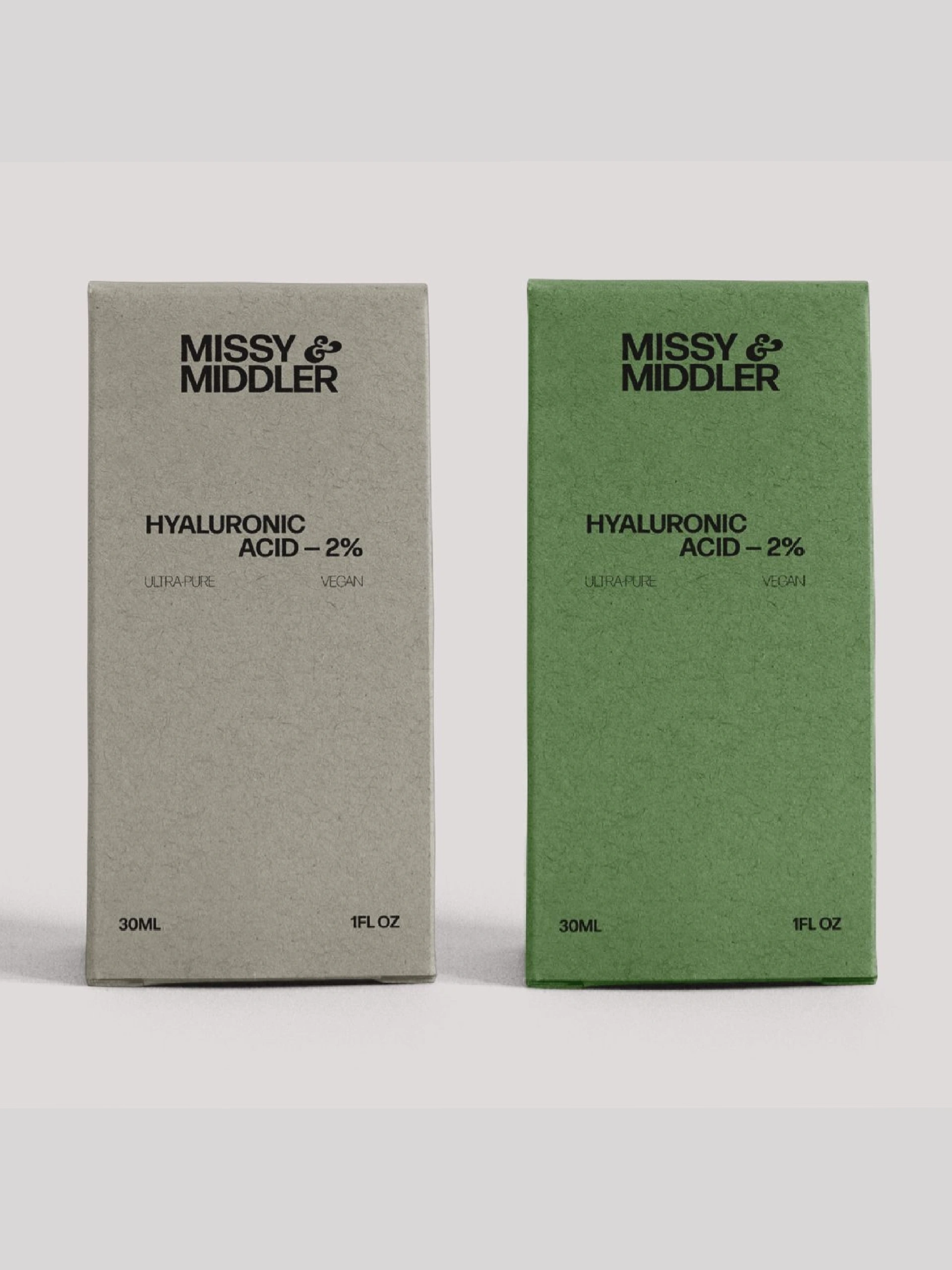
The third example showcases bold monotone colors in solid gray and green, paired with striking black typography. These boxes emphasize clarity by displaying only essential product details such as “Hyaluronic Acid – 2%.” The specialty paper here gives weight and substance, reinforcing the idea of quality and effectiveness. This style is ideal for brands positioned as scientific, clinical, and results-driven, where confidence comes from clean design rather than decorative elements.
4. Dark Luxe Perfume Boxes – Mysterious Elegance
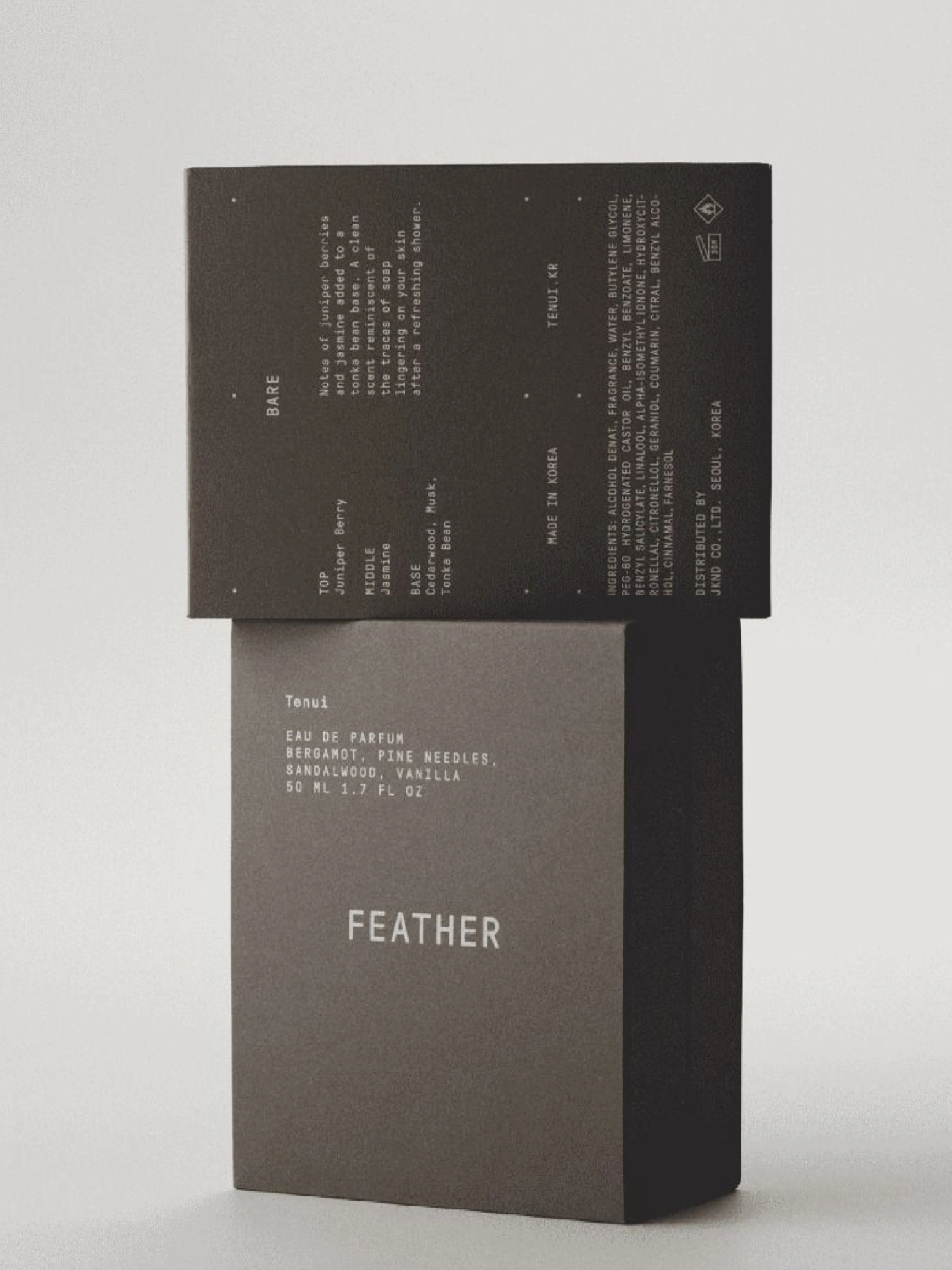
The final design is a deep black perfume box with contrasting white typography. The specialty paper enhances its sturdiness and conveys a luxurious matte touch. Text placement mimics editorial layouts, lending an avant-garde feel. The dark color palette paired with minimal wording—“FEATHER”—creates mystery and sophistication, ideal for high-end fragrance or skincare launches. This approach proves how color psychology and premium paper can work together to build an emotional connection with consumers.
Conclusion
From pastel softness to bold monochrome and mysterious dark tones, each example shows how specialty paper and color strategy can transform packaging into a brand statement. At pandapackage.com, we help cosmetic and skincare brands bring their vision to life with custom designs, eco-friendly materials, and tailored finishes. Whether your goal is to highlight purity, science, or luxury, the right packaging ensures your product stands out on the shelf and in the minds of customers.
